
#78 - Quick Color test for dark and light modes
Experimenting the color in my sketchnotes to suit dark and light modes
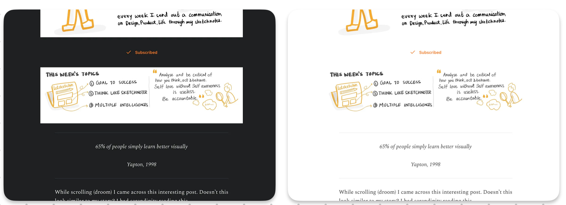
The sketchnotes I create for the newsletters have a white background. It works great in light mode. The sketches and colors go along with the white space and it retains the continuity.
But. When the system switches to dark mode you must be seeing a patch of graphic with white background. That one looks really awful.
See the difference below 😣
So I am trying to create sketchnote graphics with transparent background and a color work in both the modes.
The challenge is to come up with a color palette that works in both modes and looks elegant.
You might say what big deal. There are plenty of color palette options available online and I can choose the most standard one. You are right. Here’s what I found.

And it’s important to note that the same color is not recommended because of change in contrast ratio.

But the big problem is that I don’t have control over the color of text in the graphic or even changing the graphic for different modes.
So the only solution I have right now is to work with single color for both the modes.
Substack changes the text color to suite both the modes but there’s no option to change the image graphics.
Testing my graphics here to check which color looks good.
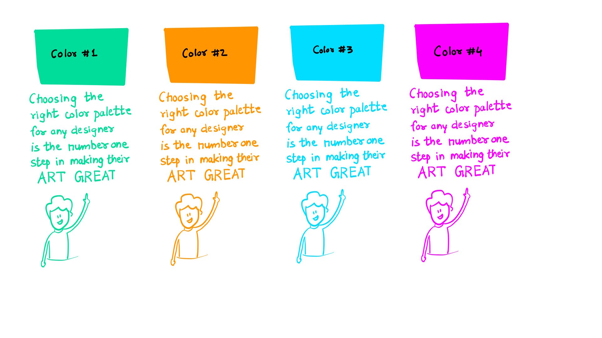
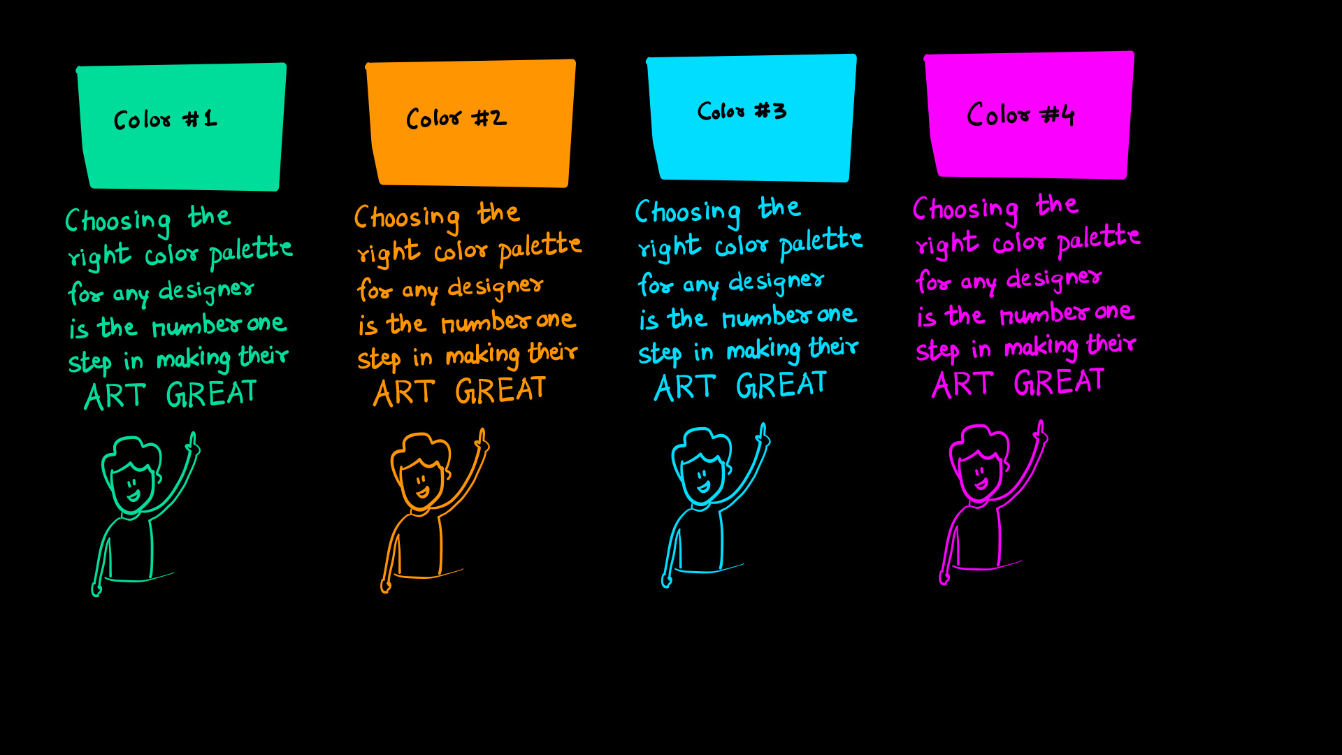
Can you help me understand and know which color looks good to you. Also comment if there’s any other way to handle this situation
That’s all I have for today.
Happy Sketchnoting.
—Kumar
P.S. Parts of this article are rephrased and grammatically corrected using AI (chatgpt).