
Let's Sketch in - Issue #12
Newsletter to learn about life, product, and design using hand drawn sketches. We'll also learn how to sketchnote.

Hello visual learners.
How are you?
Happy New Year to all of you. May you have a fabulous 2023 🎉
This is the first newsletter 🗞️ of 2023 and it comes to you via Substack.
As Revue is closing down this was my first default choice. It made my life easier. So thank you Substack.
Without delay let’s jump in today's issue
World Sketchnote Day - 11Jan
First online Meetup 🤝
Sketchnote of the week ✍🏼
Dissecting a sketch 🔬
World Sketchnote Day
For Sketchnoters around the world, January is a special month. World Sketchnote day is celebrated on 11-Jan. More details here
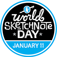
History of World Sketchnote Day
This celebration was inspired by Mauro Toselli, who wanted a day to celebrate sketchnotes and their impact on our lives. After some discussion, we settled on January 11 because 111 looked closest to 3 pencils!
Create some Sketchnotes. And remember to tag your posts on social media or your own sites with #WSDay2023 and mention @SketchnoteArmy so your sketchnote can promoted.
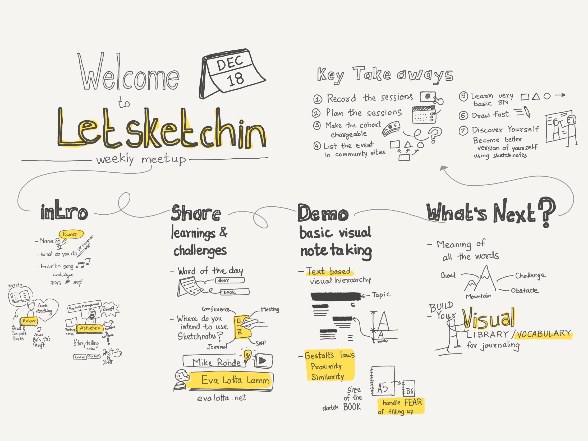
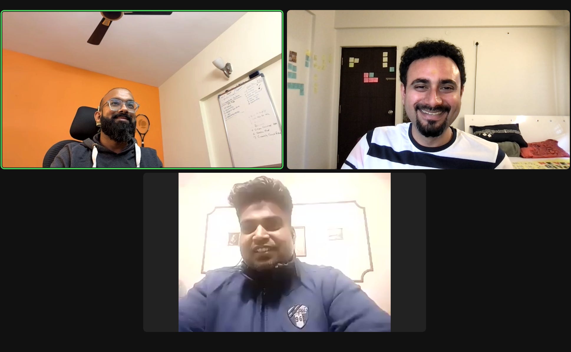
First online Meetup of Letsketchin
We had some enthusiastic visual learners join an impromptu meetup. The Minutes Sketchnote of the meeting is shared below 😁
Am going to be having such meetups often this year. Looking forward to you participation and amazing learn and share.
To keep uptodate with daily activities and meetup announcements,
Join Letsketchin Whatsapp group
Sketchnote of the week
This week’s sketchnote is by Jatin Kapdia.

Dissecting a sketchnote
For this section am using Jatin’s sketchnote. Can’t put my visual critique hat down. This is just to help improve the skill. Here are my observations
Clear distinction between title, subtitle, and body of the sketchnote. The visual hierarchy is established by Text height
Text blocks form a virtual grid, that gives certainty when scanning the whole sketchnote, making it pleasing.
Title is clear with an icon that is big enough in size to draw the attention
The quotes are placed inside frame, that draws attention and gives clear space for reading
Like the whitespace between text blocks. Makes the sketchnote look clean and crisp
Use of illustration/icons with color are adding charm to the note. Strokes in bulb and brain icons could have been less to make them look clear. The shape itself communicates it’s meaning. Remember sketchnote isn’t an art. Should be detailed enough to communicate an idea.
So next time you are creating a sketchnote you can keep these points in mind. Let me know what you created by either posting them on Twitter or Instagram and tagging me with @letsketchin or drop an email to me at letsketchin@gmail.com or
That’s all for this week. Looking forward to your Sketchnotes on World Sketchnote day. Don’t forget to tag @letsketchin.