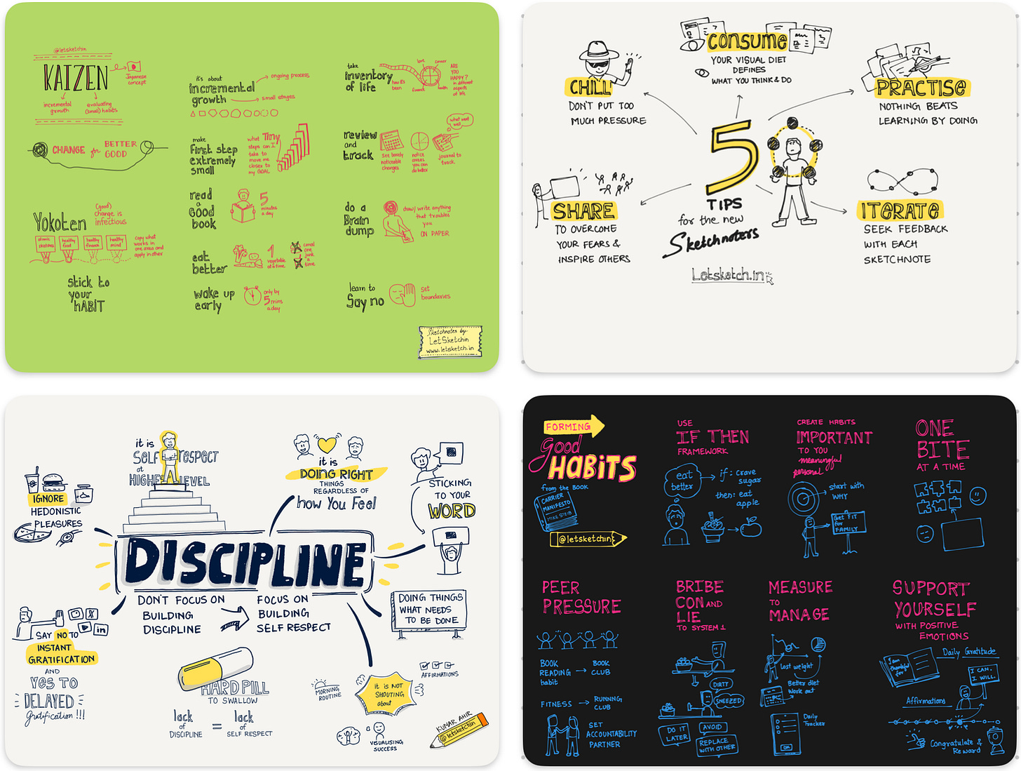
👋 Hey, I’m Kumar and welcome to my weekly newsletter. Each week I share Sketchnote(s) on product, leadership, personal growth, and anything that helps you get started on Sketchnoting.
Hello my friends.
Ever wondered what would happen if you let color decide what your sketchnote wants to feel like?
Not to decorate. Not to label.
Just to… see what it does.
🌈 A Little Color Test
Next time you’re sketching:
Do it in black first.
Pause.
Now… pick a color.
Any color.
Add that color where it feels right, not where logic says it should go.
What changed? Did something feel louder?
Softer? More hopeful?
Did it make you notice what matters more than the content itself?
Color does not add a pleasant quality to design – it reinforces it.
~=~ Pierre Bonnard ~=~
Here’s an example of one of my sketchnotes.
Pierre Bonnard was a post-impressionist painter and printmaker. His quote brings to light that a design should not rely on its coloring to make it look 'pretty', but should be used to complement the design to its full advantage.
🎭 Color = Emotion You Didn’t Realize Was There
I’ve found that adding a single streak of blue, or a burst of yellow, reveals moods I didn’t know I was carrying.
Red around a word = tension
Green = calm progress
Yellow = ‘this matters’
Sometimes it feels random, but it never is.
Our eyes know things before our brain catches up.
Here are some of my sketchnotes using different colors.
📽️ The 60-30-10 Rule (borrowed from the movies)
Filmmakers and set designers use a simple rule to guide how color shows up on screen:
60% = Dominant (background tone)
30% = Secondary (supporting color)
10% = Accent (pop! emphasis! attention!)
It’s how Wes Anderson makes you feel nostalgic.
How Christopher Nolan makes a moment feel tense.
How Pixar makes you cry (every time).
Check out this video to learn more.
And you can use it too — in your sketchnotes.
Here it’s at work.
I wanted to communicate sense of curiosity and urgency so I used yellow as background a 60% of primary color.
The black colored ink of text forms 30% that goes in contrast.
And Red to emphasis the key points and illustrations - visual summary as highlight.
⚖️ Here’s How It Works in a Sketch
60% — your base color
Maybe it’s a calm gray, pale blue, or soft beige — this holds the page together.
Most of my sketchnotes are beige in color. That’s goes with normal paper tone making the sketchnote feel analog. For clarity I will use white background.
30% — your supporting color
Maybe you’re sketching something about learning, and your secondary is a thoughtful green.
This one’s of the ink of the pen. Mostly black in my case.
10% — your pop
Use red, yellow, or purple sparingly — to make one idea stand out, to shout, “this matters!”
And this one is the highlight color that I use to emphasize key idea or subtopic. I love yellow because it’s in high contrast with black and goes well with beige/white not overpowering the background.
🖍️ What a colored Sketchnote Feels Like
When you sketch with this rhythm:
You feel more intentional.
Your notes guide the eye.
And you unlock emotions you didn’t know were hiding in your ideas.
Suddenly, that journal page isn’t just info. It’s a scene. A mood. A message.
🔍 Try This
Sketchnote something on a topic you are pondering upon or on top of your mind.
Sketch it using the 60-30-10 rule.
Pick a base tone - This mostly will be the color of you paper. If it’s digital you can choose what color to apply. Avoid bright colors to begin with.
Now sketchnote using black or a color that contrasts with background.
Choose an accent color for that one word or thought you want to shout.
It might look yuck but if colors are not “harmonious” (that’s a seprate topic) but atleast you got to practice this trick.
Notice how clarity isn’t just in what you wrote, but in how it feels now.
Until next time—Color your thoughts, color your sketchnotes.
And trust your (color) pencil to sort it all out.
Thank you for reading Letsketchin. 🥧


Hi Kumar! Great post. Well, I’m actually not good with colors. I tried several times but the outcomes were always disappointing, at least to me. Today I use colors not to highlight emotions but just to support and reinforce the architecture of the information in my sketchnotes. I’ll give the 60,30,10 rule a try, though.
Excellent post.. I was once curious about what AI thinks about my sketchnoting style and here is what it observed about use of color:
"Sparingly used, usually one or two accent colors (like blue or orange), to highlight or differentiate parts of the sketchnote. Color is more functional than decorative." Though not consciously, but I always default to black and orange, occasionally blue and hues of green.