#103 ✏️ The secret to good looking Sketchnote?
Apply visual design principles to make your sketchnote look good
Hey visual thinkers,
This newsletter comes after a loooooooooong 🙂↕️ wait.
I have been busy with major changes in professional 😇 life. But it’s back to normal now.
And to make a come back I wanted to write ✍🏼 about something that I have been practising as a designer without notice (it was part of my studies and work). But realized not everyone will know of it.
This is going to be a bit long post. So hold on till the end 😁
The secret 🤐 to good looking sketchnote.
Do you come across questions like how do I make my sketchnotes look 👀 better.
Or do you wonder why after making a sketchnote things look messy💩 .
You are then missing on some basic visual design principles⚖️ .
If followed well you can get your sketchnotes look clean, clear, and attractive.
Mind one thing though.
Sketchnotes are more about process of capturing notes and visual thinking.
It’s the outcome, not the output that matters.
👋 Hello visual learners, I’m Kumar and welcome to my weekly newsletter.
Each week I share Sketchnote(s) on product, leadership, personal growth, and anything that helps you get started on Sketchnoting.
Gestalt laws
Gestalt psychology, originating in the early 20th century, delves into how humans perceive visual elements as unified wholes rather than isolated parts.
These principles, validated through various studies, can be instrumental in creating sketchnotes that are not only visually appealing but also cognitively effective.
Gestalt principles matter deeply in sketchnotes because they align with how our brains naturally process visual information.
Let’s go through each principle and see how it matters in sketchnoting with examples of my sketchnotes.
Creating opportunities means looking where others are not.
~=~ Mark Cuban ~=
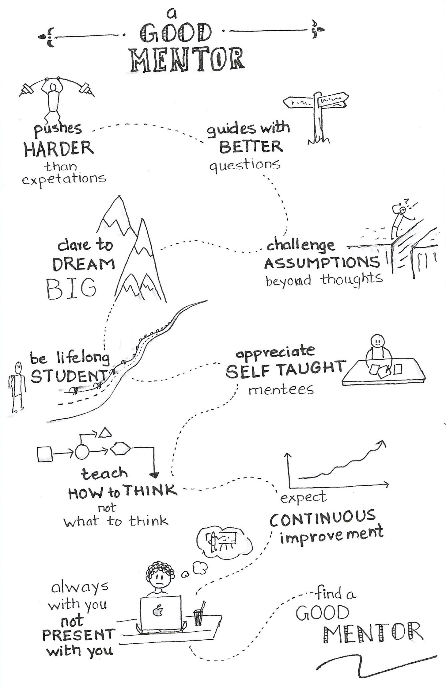
🧩 Proximity
The principle of proximity posits that elements placed close together are perceived as related. This concept is supported by research indicating that spatial closeness can override other differentiating factors like color or shape .
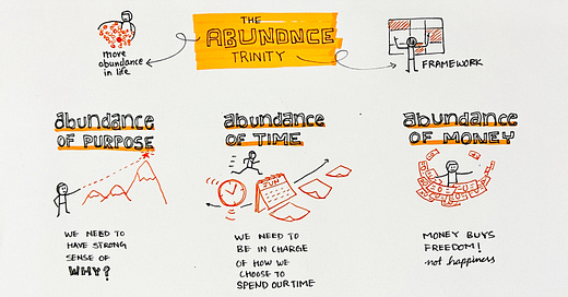
If you’re sketchnoting a talk, grouping all points from one speaker in one cluster helps the viewer navigate the flow logically.
Proximity = Clarity
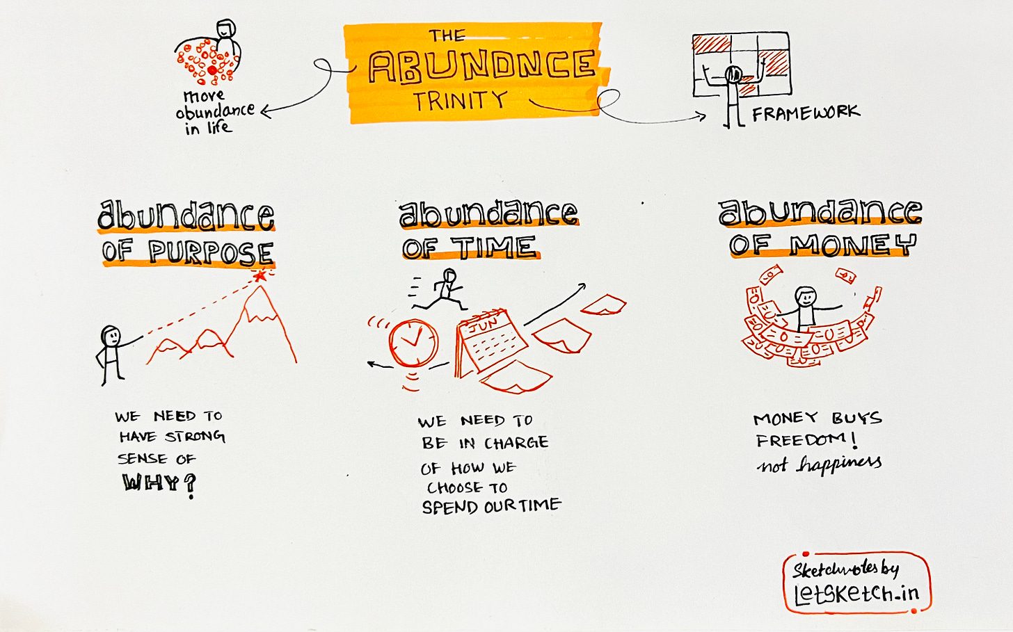
When you place related elements close to each other, your viewer instantly understands they belong together—without needing labels or arrows. This reduces cognitive load and makes your notes easier to scan.
🎨 Similarity
Elements that share visual characteristics such as shape, color, or size are perceived as part of the same group. This principle is foundational in visual perception studies .
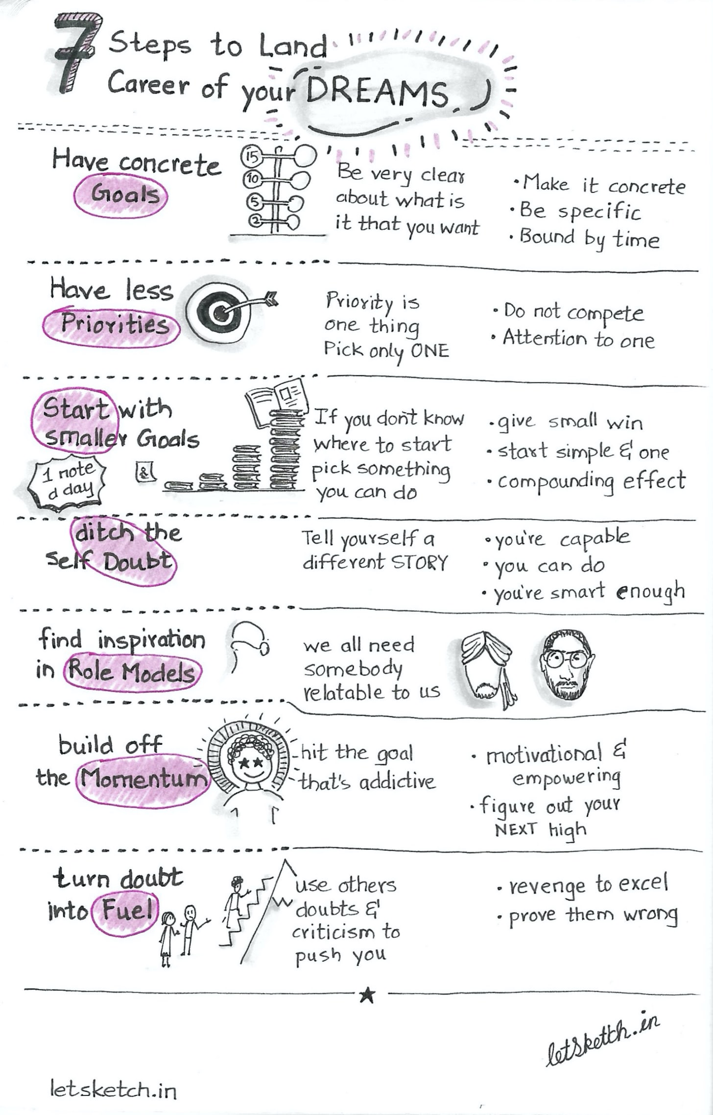
Using the same shapes, colors, or styles for similar content builds predictability. Viewers can quickly identify categories—actions, ideas, quotes—based on visual repetition.
Similarity = Consistency
Drawing all insights as lightbulbs and all tasks as checkboxes gives your sketch visual rhythm and structure.
➿ Continuity
The law of continuity suggests that the human eye is inclined to follow lines or curves, perceiving them as a continuous flow. This principle is evident in how we interpret aligned elements as part of a sequence .
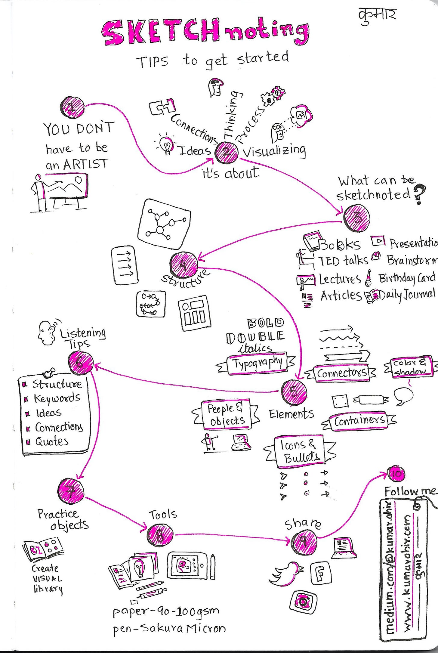
Arrows, lines, or curves guide the eye. When used skillfully, they make sure your audience follows your intended story path—from top to bottom, left to right, or any custom layout.
Continuity = Flow
In a mind map, wavy connectors between topics enhance movement and make your sketchnote feel alive.
🔘 Closure
Closure refers to the mind’s tendency to fill in missing information to perceive a complete image. Studies have shown that even when parts of a shape are missing, we can still recognize the whole .
Suggest shapes or forms without fully drawing them. For instance, a circle with a small gap can still be perceived as complete, allowing for creative and space-efficient designs.
Closure = Minimalism
You don’t always need to finish every line. Our brains love completing patterns. This saves time and keeps your sketches light while still conveying meaning.
The WWF logo employs closure by depicting a panda with incomplete lines, yet viewers effortlessly recognize the animal.
⚫ Figure-Ground
This principle involves distinguishing an object (the figure) from its surrounding area (the ground). Research indicates that our perception can shift depending on what we identify as the figure or the background .
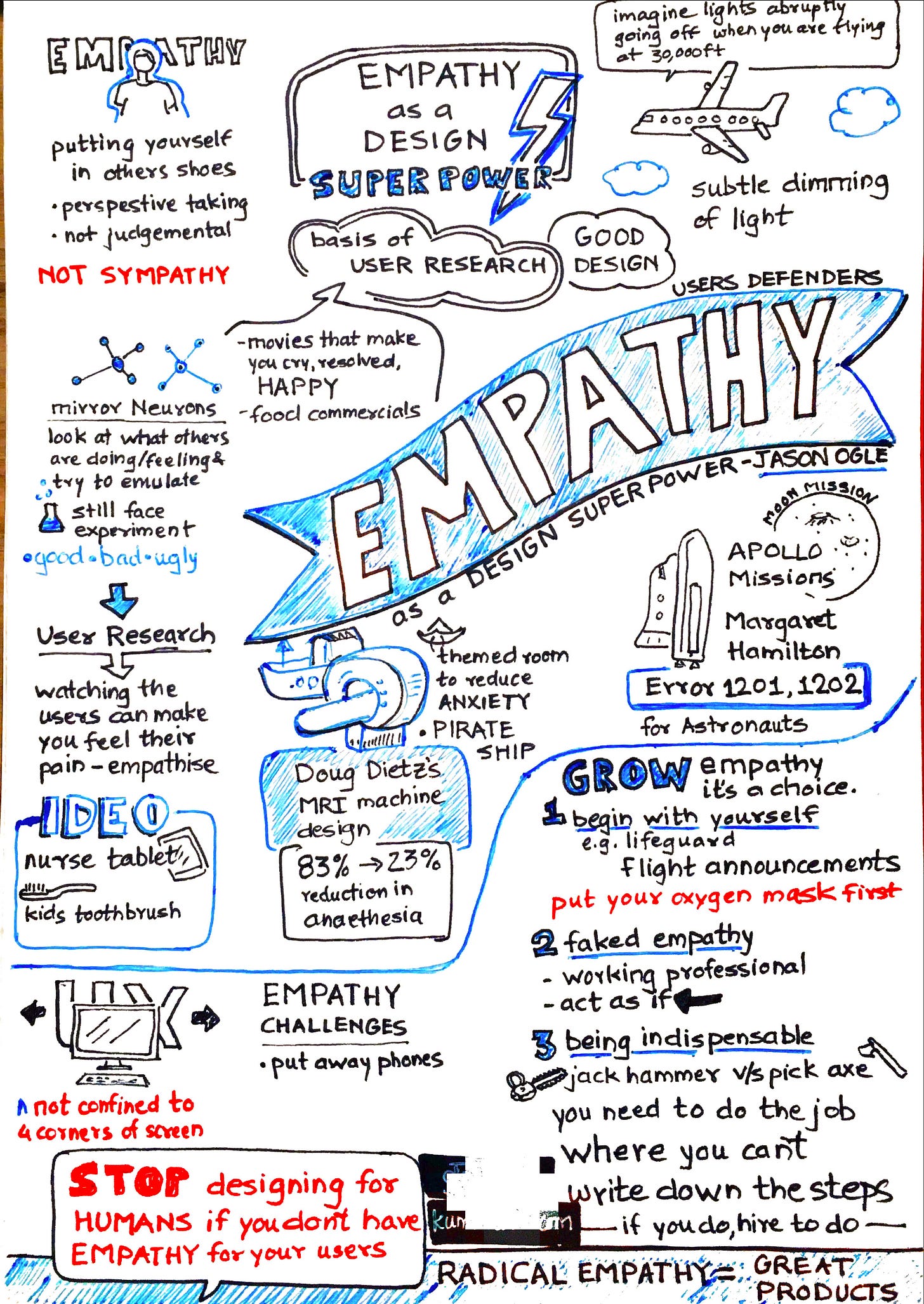
When you define the background clearly (via shading or spacing), your main ideas pop out like headlines in a newspaper.
Enhance the prominence of key elements by contrasting them against the background. Utilize shading or color blocks to make important information stand out.
Figure Ground = Focus
Highlighting a quote with a light-colored shape instantly tells the viewer: “This is important.”
⬆️ Common Fate
Elements moving in the same direction are perceived as part of a collective group. This principle is crucial in how we interpret motion and group dynamics .
When visual elements move in the same direction, our mind groups them. This is great for showing cause-and-effect or sequential steps.
Depict related concepts with arrows or lines moving in the same direction to signify their connection or shared purpose.
Three arrows pointing upward could represent progress across time—making abstract concepts more intuitive.
🪢 Putting it all together
If you are rolling your eyes and thinking how you’ll bring all of these together and remember, I have a cheat code for you.
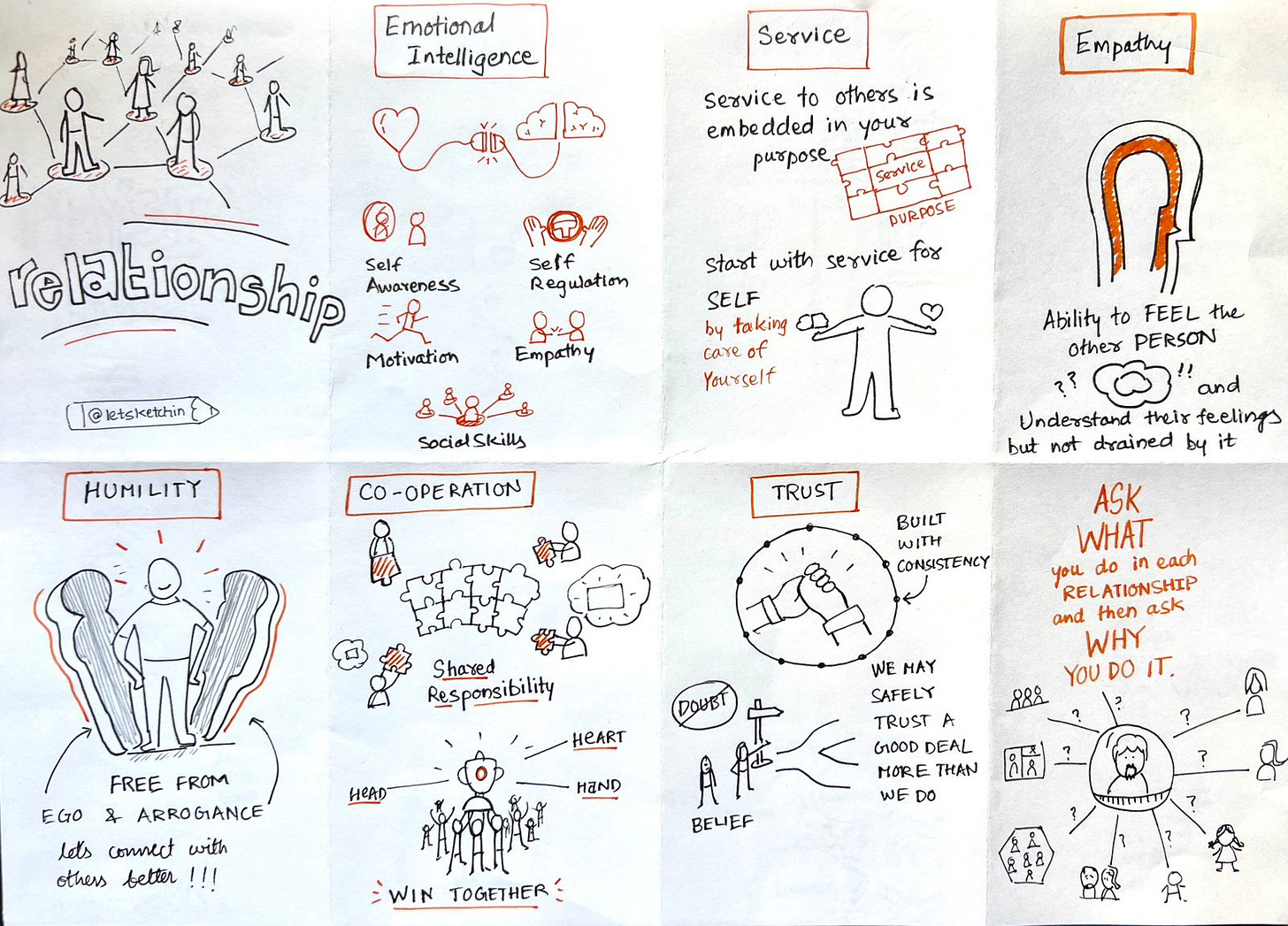
Use Grid.
Grid will allow you to group information together (proximity) and also create a structure (similarity). With the grid cells placed side by side it will provide a reading/viewing path (continuity).
Writing title in bold text will make your content stand out (figure and ground)
📝 Final Thoughts
Sketchnoting is about thinking visually. Gestalt principles allow you to present complex thoughts in a format that feels intuitive, beautiful, and memorable. They help your audience—and your own mind—see patterns, organize chaos, and retain insights.
So next time you sketch, don’t just draw what you see. Draw how you think.
Further Reading:
Until next time—practice these principles and enhance your sketchnotes visually.
And trust your pen and paper to help you out.
Thank you for reading Letsketchin. 🥧

